
Cadence Life Sciences Packaging Design
Cadence Life Sciences is a wellness community that empowers people to build transformational habits and establish milestones that matter most to them. Unlike many wellness brands that prescribe rigid paths to health, Cadence invites its community to define success on their own terms, supported by a shared accountability system. The brand offers a line of premium, science-backed wellness products designed to help individuals achieve personal health goals through the power of community.

Front-facing display of Cadence Life Sciences' wellness line including Active Meal, Active Fiber, Active Aminos, and Cherry Sleep with consistent design language.
The Project Brief
Cadence came to us as a newly-formed startup seeking to finalize packaging for their first four core products. Initially, this project was framed as a production job: clean up the existing package fronts, design the backs, and prepare them for print while ensuring FDA compliance. However, it became apparent during our first round of exploration that there was a deeper issue at play. The designs presented lacked the credibility and emotional resonance needed to connect with their intended audience.

Brand guidelines slide showing spacing and minimum size requirements for the Cadence Life Sciences logo in both centered and horizontal lockups.
With some persuasion from our team, Cadence recognized the opportunity to rethink their packaging and brand presentation entirely. What began as a production task quickly evolved into a full packaging redesign, supported by the development of brand guidelines, a refined rewards structure for Cadence's multi-level marketing (MLM) program, and the foundation of a scalable visual system for future growth.
The Challenge
The central challenge was to create packaging that could strike the right balance between two key qualities: scientific credibility and human warmth. The target audience — men and women aged mid-20s to late-60s — were not interested in products that felt too clinical, nor those that leaned too heavily into wellness trends without scientific grounding. Consumers sought products that felt trustworthy, community-driven, and genuinely effective.

Annotated design audit of Cadence’s original packaging system highlighting issues with branding inconsistency, legibility, and script font readability across SKUs.
The existing concept struggled on both fronts. Inconsistent typography, hard-to-replicate script fonts, and poor legibility were immediate red flags. Furthermore, the packaging failed to establish a clear visual hook — the kind of spark that draws consumers from across the aisle to pick up a package.
Early Research
We started with a competitive audit of leading wellness brands on the shelves at Whole Foods, Sprouts, and Trader Joe's. We closely examined how brands balanced "organic" aesthetics with clinical authority, and how design could convey a sense of community and results.

A shelf audit collage of competitive wellness and supplement packaging from brands like Vital Proteins, KOS, Sprouts, Rishi, and others, highlighting trends in design and messaging.
Two insights stood out. First, many competitors fell into the trap of looking either too clinical (sterile, distant) or too natural (verging on pseudoscience or snake oil). Second, the competitor’s packaging often lacked a memorable or engaging visual cue.
In parallel, we found some studies conducted by Stanford on consumer attitudes toward supplement brands. What we concluded from this research was that consumers wanted a brand that felt knowledgeable yet supportive, honest yet aspirational. This insight directly informed our approach to both the visual identity and messaging.
Our Solution
We grounded the project around the ideas of "precision nutrition" and “Shared Experience = Shared Results.” The final system needed to express that Cadence was serious about health and wellness, but equally committed to creating an inclusive and motivating community.
Visually, we built a system that leveraged optical illusion-inspired patterns — taking cues from the Asahi illusion — to create a rhythmic sense of movement. This approach resonated with the brand’s name and core philosophy: cadence. This visual cadence became the anchor for the packaging system, resulting in a design that stood out from competitors without feeling gimmicky.

Detailed view of Cadence Life Sciences’ atomic design elements including the sunburst logo, claim icons, precision nutrition flag, and flavor badge.
We also focused heavily on legibility and clarity. The typography system, built on Greycliff and Gotham Condensed, provided strength and warmth. Key claims such as "Vegan," "Keto-Friendly," and "Organic Ingredients" were prominently placed and easy to read. The hierarchy of information made sure that whether someone had 3 seconds or 30 seconds with the product, they could quickly understand its value.

Typography guideline slide outlining primary and secondary typefaces for Cadence Life Sciences — Greycliff and Gotham Condensed — with style previews.
Ideation & Prototyping
Our team generated three distinct concepts, each exploring different positions between "science-forward" and "community-first." Through internal reviews and client presentations, one concept emerged as the clear favorite — an asymmetrical atomic design system rooted in optical illusion.

Side-by-side comparison of three initial packaging design options for Cadence Life Sciences, each exploring distinct directions ranging from clinical to community-focused.
Accessibility Considerations
Accessibility was a priority throughout the project. We selected high-contrast colors, ensured all essential text passed contrast ratios for readability, and eliminated script fonts that could alienate younger consumers. Nutritional information, suggested use, and caution statements were carefully formatted for legibility and to follow strict FDA standards.

Designer inspects high-fidelity packaging print for Cadence Life Sciences using a magnifying loupe to evaluate color density and type legibility before final approval.
We also took the time to digitally mock up each concept and print each iteration out at-scale on a large format printer at near-production quality. This allowed us to evaluate real-world legibility, shelf appeal, and ensure each element retained their intended effect in print.
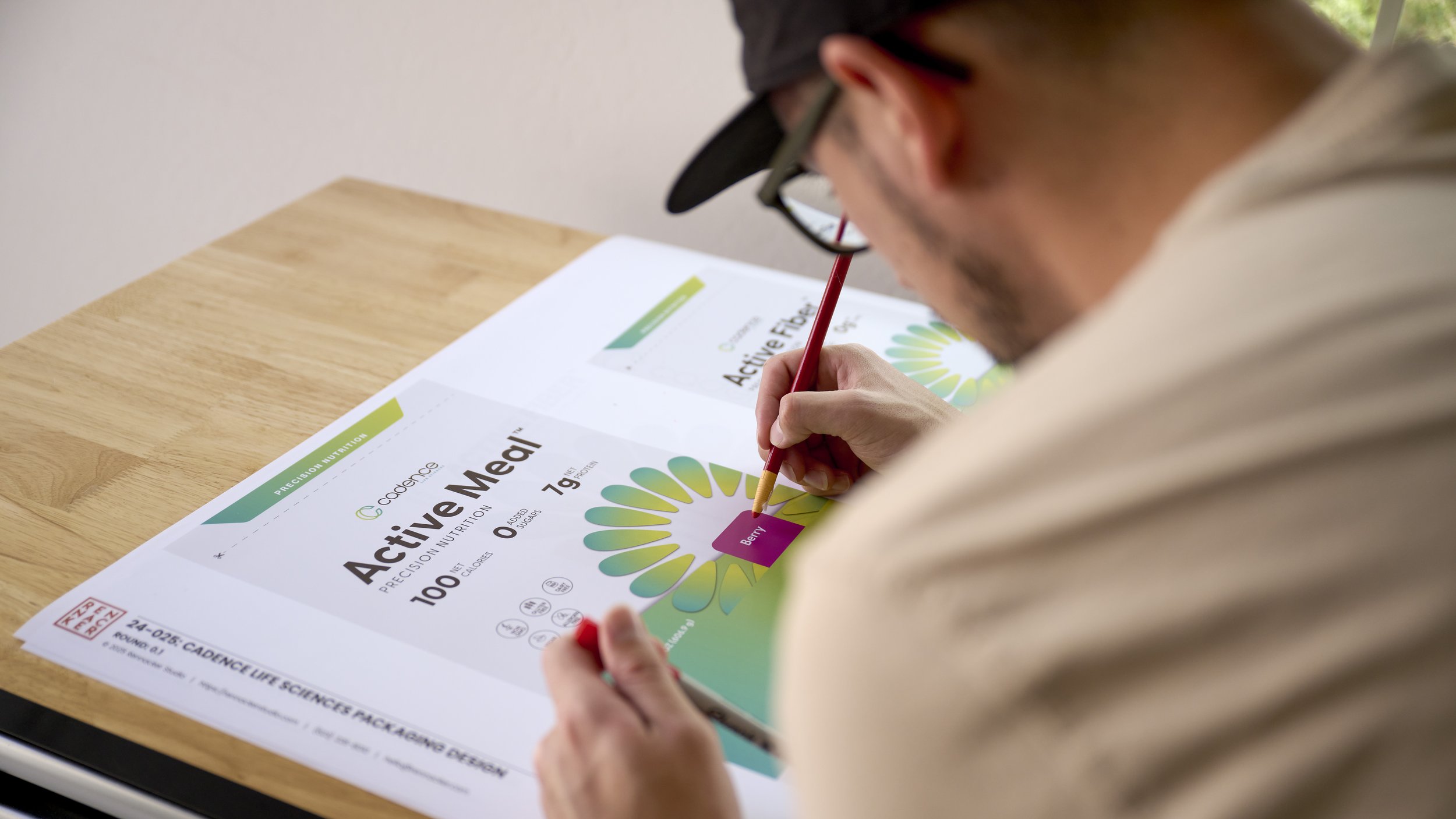
Close-up of a designer making color corrections and annotation notes on a large-scale print of Cadence Life Sciences’ Active Meal packaging.
Rewards Structure Refinement
In addition to packaging, we were asked to help refine Cadence’s multi-level marketing (MLM) rewards structure documentation. The original system lacked clarity, especially for new brand ambassadors and affiliates. Our team worked closely with Cadence’s leadership to restructure the rewards system to be more understandable, transparent, and user-friendly.

Mockup of Cadence Life Sciences' redesigned rewards structure document, featuring tables, tier systems, and clear role definitions for brand ambassadors.
We streamlined the language, created simplified diagrams, and reformatted the document to match the emerging brand system. The final rewards documentation now aligns visually and tonally with the packaging and brand guidelines, reinforcing Cadence’s positioning as both a credible and community-driven brand.
Navigating Compliance & Production
The journey from concept to final production involved numerous rounds of compliance checks and print adjustments. We collaborated extensively with regulatory teams through both Cadence’s product manufacturer and the print team at LaCore. Changes included adjustments to nutrition facts formatting, supplement facts placement, ingredient statements, and legally required markings.

Back view of Cadence Life Sciences product packaging showcasing clear FDA-compliant labeling, nutritional facts, and QR code for community engagement.
The back-and-forth with the manufacturer also revealed challenges related to printing technicalities — ink density, registration, and distortion near gussets and zippers — all of which were resolved through careful testing and dialogue. These conversations ensured that the printed product looked just as precise as our design files promised.


Outcome & Impact
The final packaging system gave Cadence the foundation for launching their first four products, but future product lines as well. We delivered a comprehensive brand guideline system, including packaging dielines, typography rules, and usage exceptions to help Cadence scale confidently.

Labeled diagram showcasing the front and back of Cadence Life Sciences’ packaging, identifying key elements such as claims, nutrition facts, QR codes, and FDA notices.
More importantly, the new packaging achieved the balance Cadence was missing. Stakeholder responses praised the packaging for feeling "trustworthy," "inviting," and "premium enough for a major grocer’s shelf."

Flat lay image featuring all four Cadence Life Sciences products — Active Meal, Active Fiber, Active Aminos, and Cherry Sleep — arranged against a white background.
The cadence of the Asahi illusion on each package, in combination with clear claims, created a visual language and atomic design system that united the product family yet looked exciting and new for consumers — all the hallmarks of an effective wellness brand.
Collaborators
Rick Fleshman; Founder and CEO at Cadence Life Sciences
Calvenn Starre; VP of Operations at Cadence Life Sciences
Richard Sloane; Director of Finance at Cadence Life Sciences
Stephen Colwell; Director of Marketing at Cadence Life Sciences
Morgan Allen; Project Management, Client and Vendor Coordination at Cadence Life Sciences
Cameron Rennacker, MS; Creative Director, Packaging Designer, Brand Strategist, Photographer at Rennacker Studio
Josh Rennacker, PE; Business Operations at Rennacker Studio
Lachelle Via; Brand Design Director at LaCore Enterprises
Gina Shilansky; Design Specialist at LaCore Enterprises