Chick-fil-A Santa Barbara Website Design
An Engaging Digital Storefront
Santa Barbara, meet Chick-fil-A
Welcome to Chick-fil-A in sunny Santa Barbara, California! In our endeavor to help this local Chick-fil-A franchise connect with their community, we crafted an inviting digital storefront that captivated the hearts of Santa Barbara residents. With stunning visuals and an intuitive navigation experience, guests were immediately embraced by the essence of Santa Barbara's charm while immersing themselves in the true spirit of Chick-fil-A.
At the heart of this carefully curated digital space, we sought to showcase the unique blend of Santa Barbara's rich culture and the cherished values of Chick-fil-A. Beyond merely presenting the restaurant's mouthwatering menu, we endeavored to create a platform that celebrated the community's shared moments and cherished memories. Through captivating, social imagery and heartwarming stories, visitors felt an immediate sense of belonging as they embarked on a journey of culinary delight and community engagement.
Image Credit: Image provided by Chick-fil-A Corporate — photographer unknown.
Introducing Travis Collins
Allow us to introduce the face behind the Santa Barbara franchise! Travis Collins, the passionate Owner/Operator, played a pivotal role in the vision we brought to life through the website. His unwavering commitment to exceptional service and community involvement was showcased prominently, reinforcing the values that have made Chick-fil-A a beloved nationwide favorite.
Accessibility and Inclusivity First
English or Español
Inclusivity was central to our design approach. By providing content in both English and Spanish, we ensured that most guests, and employees felt welcomed and valued on the Chick-fil-A Santa Barbara website. Embracing diversity, we strived to create an inclusive user experience that catered to a broader audience.
Mobile first
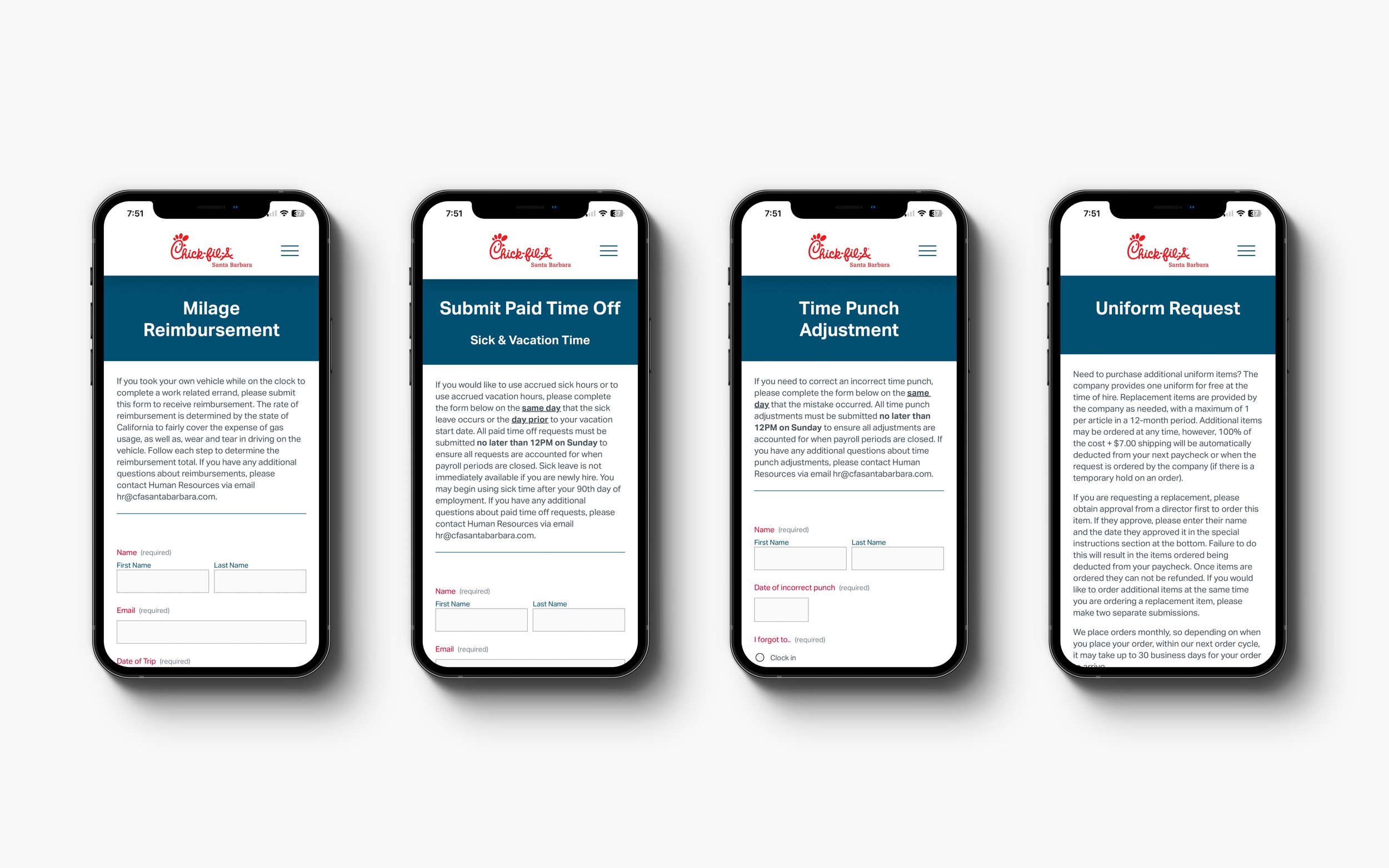
When you’re looking for a tasty bite of Chick-fil-A or you’re an employee submitting for paid time off, generally you’re not sitting in front of your computer. This was obvious to us. Above all else, we ensured that Chick-fil-A Santa Barbara’s website was mobile-friendly. We didn’t just focus on aesthetics though — we ensured that any capabilities available on desktop were also available on mobile to keep the bustling community of Santa Barbara and the store’s employees on-the-move.
Chick-fil-A Cares
Making a positive impact
Chick-fil-A Santa Barbara, understands the importance of community engagement and giving back. Our thoughtful design highlighted the restaurant's philanthropic side, making it easy for visitors to explore Chick-fil-A's commitment to making a positive impact in the local community. From fundraisers to supporting various school and student programs, the website was a gateway to Chick-fil-A's altruistic efforts.
Nurturing Future Leaders
Investing in the leaders of tomorrow is a fundamental aspect of Chick-fil-A's values. With this in mind, we dedicated a prominent section of the website to showcase programs that fostered the growth and development of young minds through student-centered initiatives. Our goal was to emphasize the importance of education and personal growth, demonstrating the positive influence Chick-fil-A has on future generations.
Giving Back to the Community
Central to Chick-fil-A Santa Barbara's ethos was the desire to make a tangible difference in the lives of community members. Our comprehensive solution seamlessly facilitated donation requests, allowing the restaurant to extend a helping hand to local initiatives and contribute to charitable causes. The user experience was at the forefront of this process, ensuring that giving back was effortless and impactful.
Empowering Managers, Empowering Employees
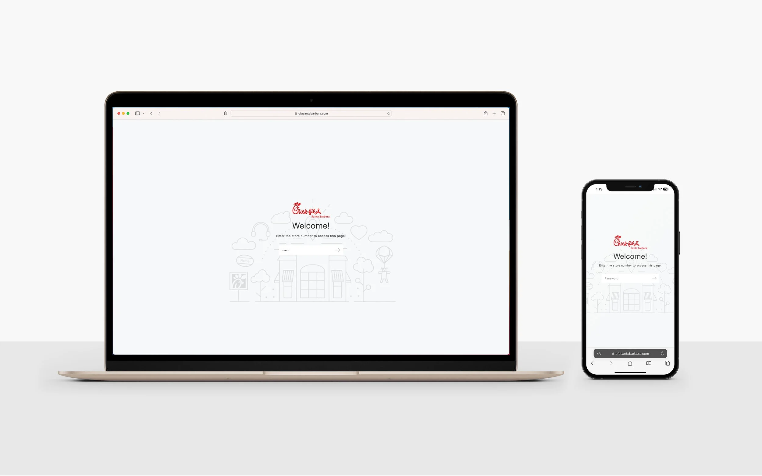
A secure, one-stop hub for updates and documents
Efficiency and collaboration were integral to Chick-fil-A Santa Barbara's operations. Our expertise included developing an exclusive employee resource center, designed to serve as a secure, one-stop hub for store managers and employees. This centralized platform allowed for seamless updates and easy access to essential documents, streamlining daily operations and fostering enhanced communication.
Instant access to essential materials
Empowering Chick-fil-A Santa Barbara's employees with the tools for success was one of our key priorities. Through our intuitive design, we ensured instant access to crucial resources such as training videos, employee handbooks, time-off requests, and more. With essential information readily available, the team could thrive and excel in their roles.
Efficiency Meets Confidentiality
Signing securely
Recognizing the importance of confidentiality, we prioritized secure document signing for employees by integrating DocHub. Whether it was national or state-specific documents, employees could sign with confidence and managers could easily remain in state compliance, knowing that both manager’s and employee’s personal information remained protected.
Secure and effortless submissions
Efficiency was at the forefront of our approach to submissions. Through the employee resource center, we streamlined the process for various requests, including time punches and paid time off requests. Employees could effortlessly submit their needs, ensuring prompt and effective responses from management.
Making Human Resources More Human
Welcoming New Team Members
At Chick-fil-A Santa Barbara, the onboarding experience for new team members was of utmost importance. Through our website design, we crafted a seamless and welcoming journey for new hires. From orientation material checklists to helping them assimilate into their new Chick-fil-A culture, we aimed to set the stage for their successful integration into the team.
Image Credit: Image provided by Chick-fil-A Corporate — photographer unknown.
Benefits - Valuing Employees
We focused on thoughtfully showcasing Chick-fil-A's dedication to valuing its employees. With a dedicated section highlighting employee benefits, we underscored the notion that the well-being and satisfaction of the team were at the heart of Chick-fil-A Santa Barbara. By presenting a comprehensive overview of the perks and rewards, we aimed to reinforce the bond between the restaurant and its valued employees.
Culture - Fostering a Positive Work Environment
A positive work environment is the cornerstone of any successful organization. Through our website, employee’s could gain valuable insight into this Chick-fil-A franchise’s unique culture, where team members felt like part of a supportive family. We aimed to reflect the positive and uplifting atmosphere that defined Chick-fil-A Santa Barbara's workplace, inspiring employees to continue being a part of this vibrant team community.
Growth — The sky’s the limit
Encouraging personal and professional growth was a key aspect of our design solution. We recognized that Chick-fil-A Santa Barbara's employees deserved opportunities for career advancement and development. Thus, we created a dedicated section that provided resources and insights to help team members realize their full potential and pursue their aspirations.
Staying True to the Chick-fil-A Identity
Adhering to national brand standards while incorporating local charm
Maintaining the integrity of Chick-fil-A's national brand standards while infusing Santa Barbara's local charm was an extremely careful balancing act. Through our meticulous design, we achieved a harmonious brand experience that resonated with both loyal Chick-fil-A guests and the Santa Barbara community. The result was a cohesive and delightful representation of Chick-fil-A Santa Barbara's conformant yet unique identity.
Consistency in brand experience was paramount to our design philosophy. We ensured that Chick-fil-A Santa Barbara's website reflected the restaurant's core values, creating a sense of familiarity and trust for guests and employees alike. From the moment visitors landed on the website to the time they placed an order or sought employment, they experienced a cohesive and engaging journey.
Summary
Our collaboration with Chick-fil-A Santa Barbara has culminated in an exceptional digital platform that perfectly captures the essence of this beloved franchise. From the engaging storefront that warmly welcomes Santa Barbara residents to the seamless ordering options and efficient employee resource center, every aspect of the website was tailored to address the specific challenges and aspirations of our client.
We aimed to empower Chick-fil-A Santa Barbara in fulfilling its commitment to the community through a showcase of philanthropic efforts and nurturing future leaders. Through effortless ordering and convenient catering options, we ensured that guests could enjoy Chick-fil-A's culinary delights with ease. Meanwhile, the employee resource center streamlined communication and resource access, fostering an efficient and collaborative work environment.
Our dedication to accessibility and inclusivity led us to offer content in both English and Spanish, embracing diversity and ensuring that every visitor felt valued and welcomed. We took great care to integrate Chick-fil-A's national brand identity with Santa Barbara's local charm, creating a cohesive brand experience that resonated with guests and employees alike.
Rennacker Studio Is immensely proud to have contributed to the success of this project, and we extend our heartfelt appreciation to Breanna Cronen and Travis Collins, the dedicated Chick-fil-A partners on this journey. Their invaluable insights, collaboration, and swift decisions have been instrumental in bringing this vision to life. We are grateful for the opportunity to have been a part of this remarkable endeavor and look forward to witnessing Chick-fil-A Santa Barbara continue to flourish and make a positive impact in the lives of its customers and employees through our ongoing support.
Partners
Sector
Food and Drink
Hospitality and Leisure
Retail
Project Team
Breanna Cronen
Travis Collins
Discipline
Brand Identity
Web and Digital Design
Collaborators


