CIA + ASU Engineering STEAM Hackathon
It’s not everyday that you get to work with two incredible titans on the same project. The CIA (yes, that CIA) and Arizona State University (ASU) have a long-standing relationship of collaboration. The latest of those efforts was an interactive STEAM (science, technology, engineering, art, and math) hackathon for all ages where groups would be engineering Rube Goldberg-style chain reaction machines with provided materials and an interactive storyline featuring a fictional cartoon character named F.R.E.D. (Friendly Robotic Engineering Droid). The goal of each team’s machine? To “Find F.R.E.D.” and simultaneously prove that your team didn’t kidnap F.R.E.D.
Under The GIT Creative Agency, we had the incredible opportunity to collaborate with these two clients to bring this inspiring event’s branding, marketing, collateral, event photography, and even F.R.E.D. himself to life!
Introducing Your Friendly Robotic Engineering Droid (F.R.E.D.)
During the Fall 2023 semester, The GIT Creative Agency was approached by Dr. Shawn Jordan to help him bring an idea for an interactive STEAM hackathon to life. At the time, a logo was the only solid deliverable that was needed.
Initial concept walkthrough meeting between Dr. Shawn Jordan, members of the CIA, Erik Gillman, and The GIT Creative Agency during the Fall 2023 semester.
Armed only with an abstract understanding of a odd-sounding event, a name for said event, and a stylistic request from Dr. Jordan for a “steampunk look,” the team began working on a few conceptual ideas.
A few initial concept sketches for the Finding F.R.E.D. logo.
After a few weeks of ideation, some feedback from agency leadership, and a hunch, we narrowed the logo concepts down to a few options, each with their own strategic approach. We wanted to leverage each concept’s unique identity to show how the agency foresaw the branding to be applied in collateral and would ultimately bring this event to life. “Make it steampunk,” was a great request—but has been done a thousand times before!
Collectively, the agency decided that we wanted to integrate steampunk elements but do it in a more modern, less tropeish way—fusing our ideas with gears, lightbulbs, and robots-themed elements. From this creative vision, we presented four separate concepts:
Concept 1: Lightbulb Design
Our first concept leveraged an iconographic and typographic approach. Using a lightbulb with a gear-shaped filament as the icon and a playful slab-serif font for the brand typography.
Concept 1 logo design in black and white and in color.
Concept 1 design renderings.
Concept 2: Gear Design
Our second concept leaned a bit more heavily into a typographic solution. Using the alliteration of “Finding F.R.E.D.” to create a mirrored symmetrical gear logo.
Concept 2 logo design in black and white and in color.
Concept 2 design renderings.
Concept 3: F.R.E.D. Stamp Design
Third, we approached a more self-contained solution that featured a cartoon illustration of F.R.E.D. himself as the mascot for the brand surrounded in a stamp-style logo.
Concept 3 logo design in black and white and in color.
Concept 3 design renderings.
Concept 4: F.R.E.D. Head Design
And finally, our forth option was to simplify option 3 into more of a linework-style drawing to make F.R.E.D. appear more like an icon rather than a cartoon, yet still fun and playful.
Concept 4 logo design in black and white and in color.
Concept 4 design renderings.
We presented this work to Dr. Jordan, and the CIA—which was exactly as nerve-racking as it sounds. Together, the vote was unanimous, they loved it all! But like most good things, a decision had to be made. We gave everyone the weekend to think it over, and they came back to us wanting a blend of elements from concept 3 and concept 4. We could work with that!
Final design concept renderings.
The audience for this event would mostly be children, and the mascot approach—leveraging the use of F.R.E.D.’s robotic cartoon head as the logo—was an obviously wise choice.
Engineering The Event’s Collateral
The hardest part of any event is planning and making sure you have everything you need to ensure the event goes off without any obstacles. The agency team had a laundry list of collateral to produce for this “chain reaction mystery” event. With each deliverable added to the list, seemingly, two other supporting elements came with it.
Social Media Marketing and Event Registration
Brand immersion begins well-before teams arrive to the event! Hacking teams first needed to register to attend, but before that, they need to know the event is happening! Initially, we were going to leverage @asuengineering Instagram profile, which has more than 8,500 followers, to advertise the event.
The team created a series of social media posts/ads, including a posting schedule, that encouraged teams and individuals to register. Unfortunately, we were not able to obtain the approval from the @asuengineering social team to hijack their feed for a few posts.
Original social media concept design.
On the bright side, Dr. Jordan was able to have the event published on the Ira A. Fulton Schools of Engineering’s blog called Inner Circle as well as being listed on EG Publishing’s website, a local newspaper.
Inner Circle blog post promoting the chain-reaction mystery hackathon competition.
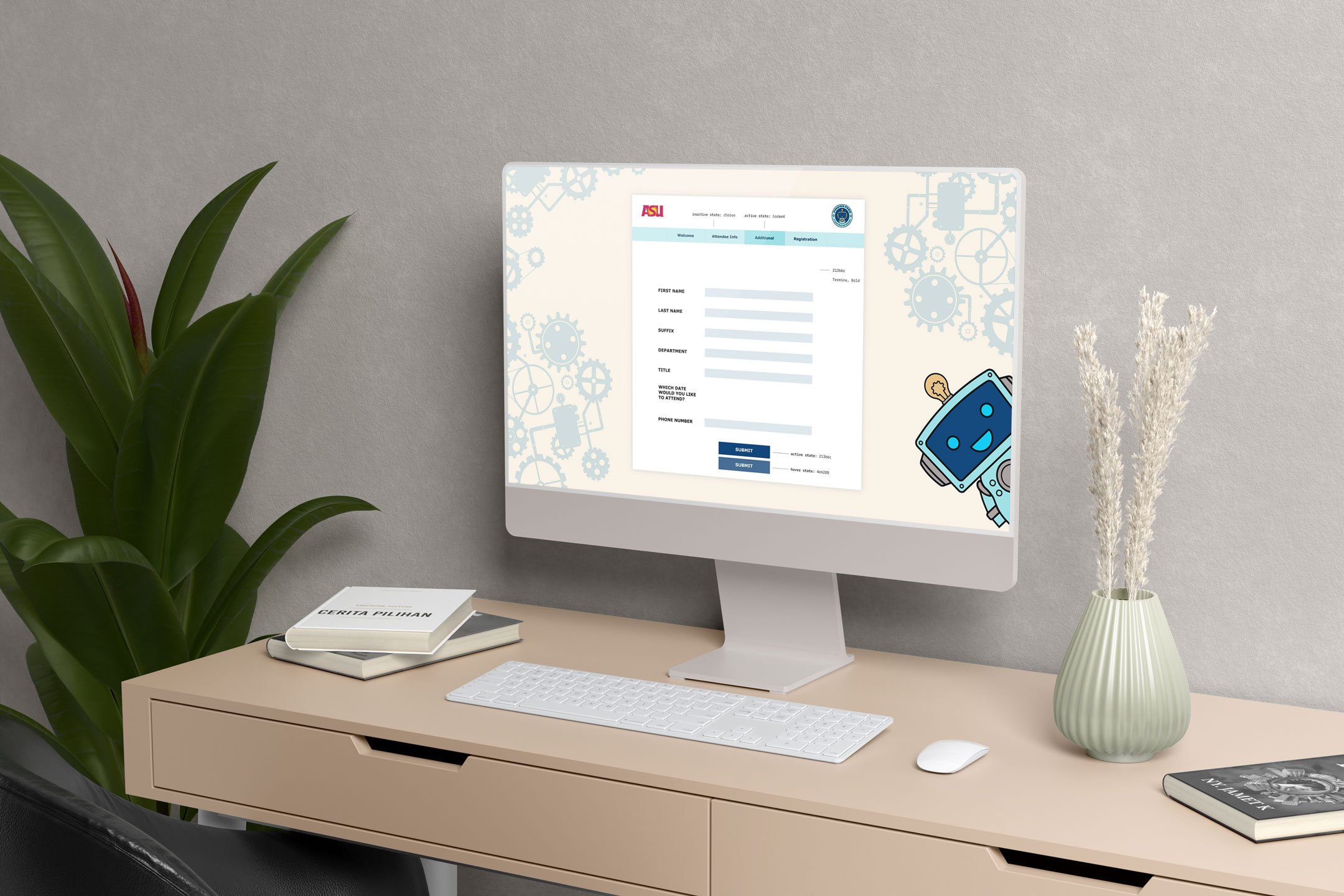
Once teams decided to register, they would complete their registration on a landing page powered by STOVA which would also bear event-specific branding with F.R.E.D. peeking out from behind the registration screen.
STOVA online registration form
Wayfinding and Signage
The ASU college campuses can be a bit confusing. Once teams arrive, they need to know they are in the right spot. Since participants had already been exposed to the brand through registration, we created large, A-frame signage that would clearly guide drivers and pedestrians toward the check-in booth.
Hackathon directional wayfinding signage.
At check-in, folks would be greeted by a 5.5-foot-tall cut-out of F.R.E.D. welcoming them to the event, and reinforcing that they are in fact in the right spot.
Life-size 5.5-foot-tall cut-out of F.R.E.D robot welcome sign.
Once in the lobby, guests would also be greeted by a 6-foot retractable banner with the event sponsor’s logos, including: STEAM Labs, The Central Intelligence Agency (CIA), South Mountain Community College, The Storytelling Institute, and Arizona State University’s Ira A. Fulton Schools of Engineering.
Printed wayfinding collateral pieces side-by-side.
Check-in
At the check-in booth, every guest received a grey F.R.E.D. tee shirt with a full-color, direct-to-garment printed logo on the front. With over 300 participants, it was quite a sight to see the work we had produced being proudly worn by nearly everyone in attendance.
Close to 300 people were in attendance and nearly every single person wore a F.R.E.D. branded tee shirt.
Each staff member also wore a F.R.E.D. tee shirt. However, to differentiate staff from teams, we chose to make them a bright, sky blue with the word “staff” printed on the back in big, bold letters. Each staff member got to accessorize their outfits with robot toys placed somewhere on their person—one person even chose to tape theirs on.
Staff members proudly wore their sky blue F.R.E.D. tees and accessorized with robot toys.
Name tags were printed out in advance for each registered participant so staff could easily know who they were working with and address them by name. Teams also needed to know where to go! Everyone’s name tags had their team number printed on them—that number would correspond with a tent sign at each station to keep groups together and identifiable in case anyone got lost or wasn’t able to find their workspace.
Name tags helped staff address team members by name, but also helped identify which team they were on and which table they should be working at.
Immersing The Audience
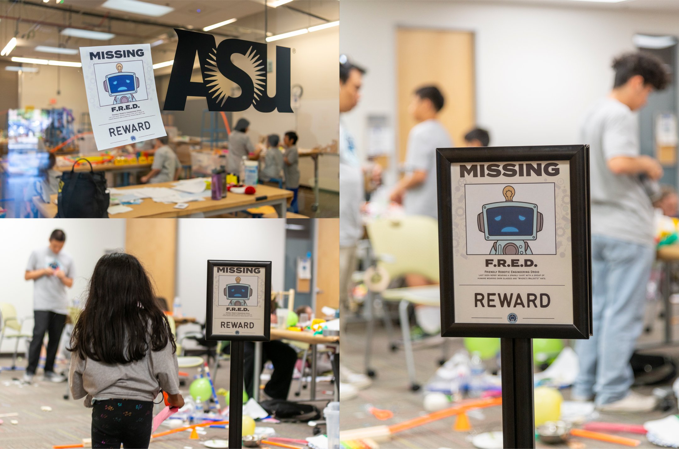
Once guests passed the check-in tables and stepped through the doors of the Chandler Innovation Center, “missing” posters of F.R.E.D. were plastered all over the walls. Each poster mentioned a reward for finding F.R.E.D. alongside a mugshot of him with a sad look on his face.
F.R.E.D’s “missing” posters were posted all over the Chandler Innovation Center.
Other immersive elements included a bit of play money that teams could use as souvenirs to keep. Some teams even chose to use their money as real currency to buy off supplies from other teams. Along with the play money, each team was given a detective’s notebook to keep track of thoughts and sketch out ideas.
Tee shirts, notebooks, play money, and name tags were just a few branded items team members were given.
Each team was provided with a story/work book that utilized variable data to ensure that every team had slightly different information and would prompt teams to produce a different chain reaction machine to solve all the mysteries related to F.R.E.D.’s disappearance.
The workbook we had designed was used to deliver unique stories to each team and serve as a space for teams to ideate their solutions.
Of course, every event needs a PowerPoint deck! So, we created a template that event staff in each room could modify themselves, while still retaining the overall brand presence.
PowerPoint presentations could be easily updated during the event but still retained the branding and immersive design elements.
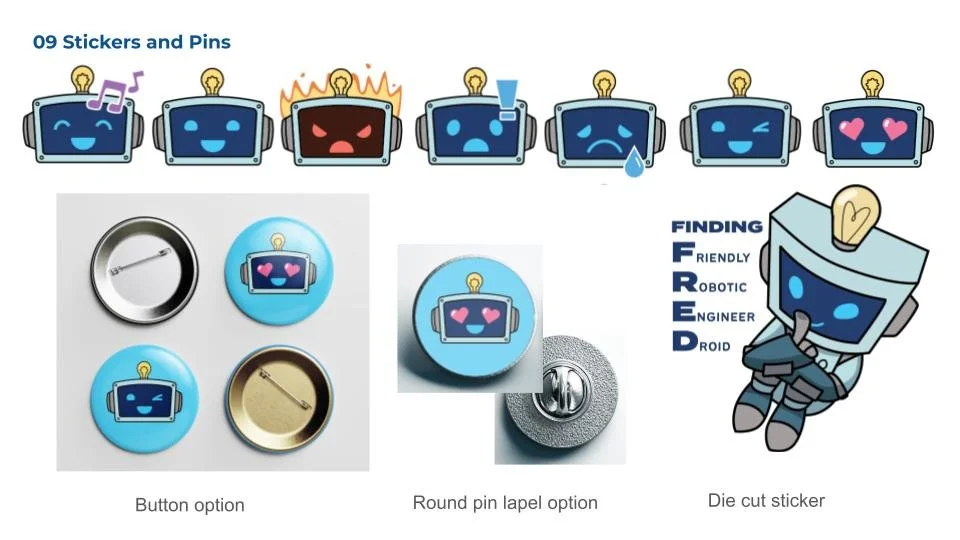
Stickers and pins were also designed and were going to be handed out at the event. Unfortunately, the printer was running a bit behind and they didn’t make it in time, but will certainly be at the next hackathon!
Fred emote icon stickers/pins to be handed out at the hackathon.
Awards!!!
You simply can’t have an event like this without some type of award! Five categories were created: First, second, third, best engineering, and most imaginative story. At the end of the event, teams were awarded with first place earning a $2000 reward, second earning $1000, and third $500.
3D-printed trophies for hackathon winners.
Each trophy was 3D printed to further reinforce the STEAM focus of the event. The Chandler Innovation Center is a massive maker’s space with dozens of 3D printers on-site. So the original plan was to print the trophies on-site the day of the event. This could have been a feasible approach, but to avoid any potential printing errors, we decided to print each trophy in advance.
Although, we would still livestream the 3D printing of a larger F.R.E.D. head on each presentation screen. Cleverly, we perfectly sized the 3D file so the amount of time it would take to print would be the exact duration of the event—thus serving as an active visual element and a countdown timer for teams to build to. The more complete F.R.E.D.’s head became—the faster teams needed to build.
Each 3D-printed trophy featured different colors and plaques based on the award won.
Making F.R.E.D. A Life-size Reality
Dr. Jordan pulled in two amazing engineers, Erik and Quinn, and a fashion designer [Insert Designer’s Name] to help bring a real robot version of F.R.E.D. to life. We designed a 3D rendering to give the robotics team a more comprehensive idea for how we envisioned his body to look. The plan was that once everyone was done hacking, F.R.E.D. would come out of hiding and make a big reveal to the crowd.
360º 3D rendering of F.R.E.D.’s full body to be used for engineering.
With this rendering, Erik and Quinn would collaborate for months on creating a life-sized, animatronic robot—complete with articulating arms, a TV screen for a face, an illuminating lightbulb on his head, and a movement system crafted from a repurposed RC car.
Character rotation design for F.R.E.D.
But we wanted the kids to be able to experience F.R.E.D. in a more interactive way! Erik informed us that they would be using a network-connected ASUS tablet as F.R.E.D’s face. So we collaborated on a solution to design a few different facial expressions that could be displayed on-screen via a Zoom screen share where F.R.E.D.’s operator could hear questions from kids, and answer them in real-time.
“Happy” animation of F.R.E.D.’s face.
“Sad” animation of F.R.E.D.’s face.
“Shocked” animation of F.R.E.D.’s face.
“Angry” animation of F.R.E.D.’s face.
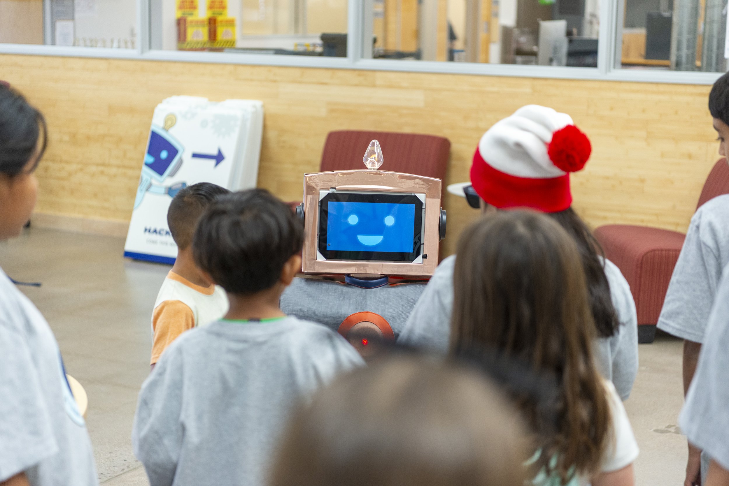
My gosh! Did we underestimate how popular F.R.E.D. would be! Kids gathered for over an hour to ask their Friendly Robotic Engineering Droid questions about science, technology, engineering, art, and math (STEAM).
Kids gathered around F.R.E.D. to ask questions. Most popular question: “Who stole you!”
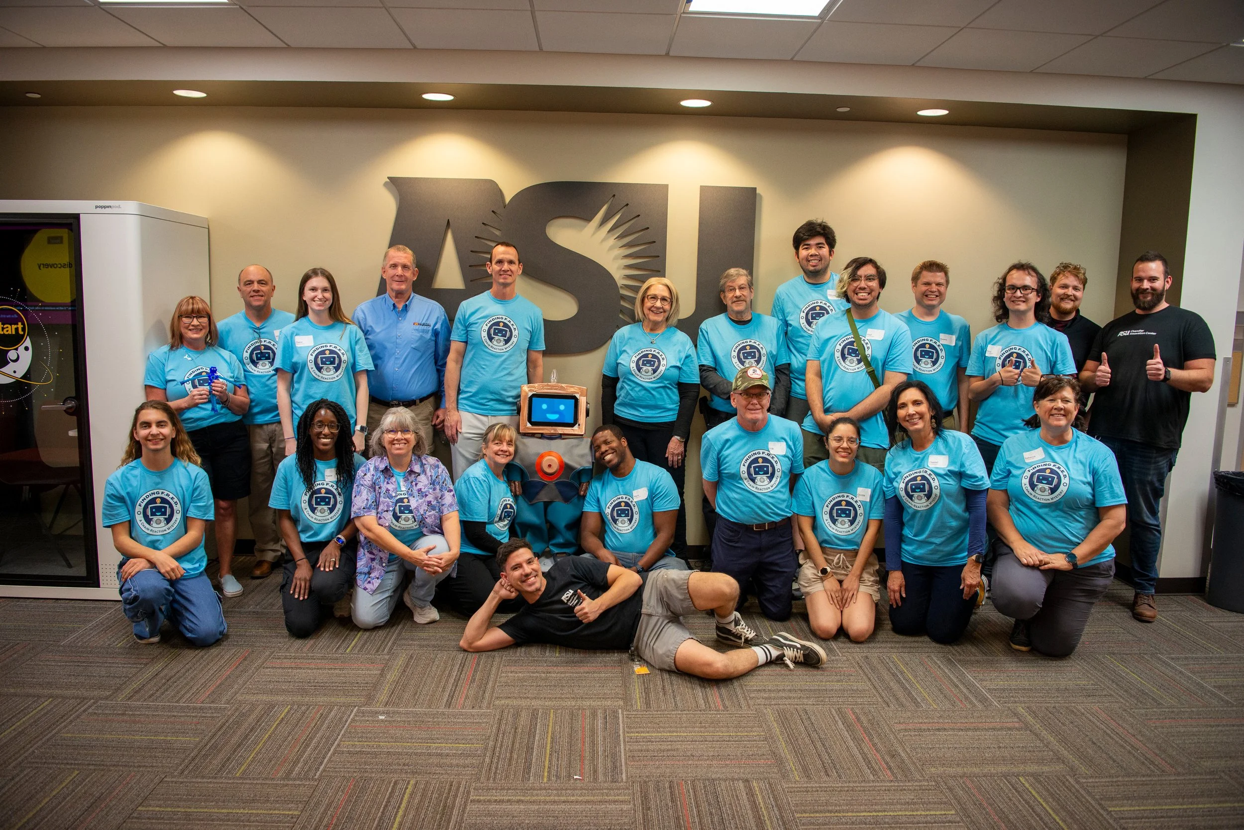
Even the staff and volunteers fell in love with F.R.E.D. and made sure to get a group photo with him!
Documenting Our Work and The Event
At the end of such a massive, comprehensive project, it’s always nice to go see how people respond to it. It’s the ultimate qualitative research under the guise of having fun! But we still had work to do!
Our team was also tasked as the official event photographers to capture the joy and fun each team was having and the incredible machines each team would build. This was also a great opportunity to photograph the work we produced in person with real people interacting with our work. Together, we delivered nearly 300 images that will be used in digital and print publications across ASU to tout the success of this event which undoubtedly sparked curiosity in the next generation of STEAM engineers and maybe a few future CIA agents.
Cameron Rennacker and Adeline Pate photographing the hackathon event.
Final Thoughts
If you’re still reading, I’m sure you’re tired too! This project was LOADS of work but couldn’t have been done without the incredible people behind the project. The saying, “it takes a village,” is grossly underrepresented in this situation—it took an ARMY! We’re especially grateful to Dr. Jordan and the CIA for trusting two semesters of The GIT Creative Agency to work alongside them on this opportunity to learn and grow. The opportunity that was provided to our team in bringing this Hackathon to life was incredibly rewarding.
Fall 2023 GIT Creative Agency team in design review looking over concepts to be presented to the client.
Collaborators
Dr. Shawn Jordan; ASU, Ira A. Fulton College of Engineering, Interim Director of the Schools of Integrated Engineering
Multiple Agents who can’t be named 😳; The Central Intelligence Agency
Professor Kassidy Breaux, MS; ASU, Ira A Fulton Schools of Engineering, Graphic Information Technology, Assistant Teaching Professor, The GIT Creative Agency
Cameron Rennacker, MS; The GIT Creative Agency, Creative Director / Strategist / Project Manager / Photographer
Katie Stains, MS; The GIT Creative Agency, Art Director / Designer
Andrea Garcia; The GIT Creative Agency, Team Lead (Concept Design and Branding)/ Designer
Richard Xu; The GIT Creative Agency, Designer / Developer (Concept Design and Branding)
Tejaswini Barde; The GIT Creative Agency, Designer (Concept Design and Branding)
Adeline Pate; The GIT Creative Agency, Event Photographer / Designer (Production Design)
David Chandler; The GIT Creative Agency, Designer (Production Design) / Print and Imaging Lab Expert
Pratik Pansare, MS; The GIT Creative Agency, Designer (Production Design)
Alexandra Benke; The GIT Creative Agency, Designer (Production Design)
Jamie Stroh; The GIT Creative Agency, Designer (Production Design)
Jessica Bullock; The GIT Creative Agency, Designer (Production Design)
Kirsten Harris; The GIT Creative Agency, Designer (Production Design)
Molly-Anne Manzano; The GIT Creative Agency, Designer (Production Design)
Monet Almaraz; The GIT Creative Agency, Designer (Production Design)
Sai Divya Reddy Alley; The GIT Creative Agency, Designer (Production Design)
Sannuthi Ravichandra; The GIT Creative Agency, Designer (Production Design)
Erik Gillman; Engineer, F.R.E.D. Life-size Robot
Quinn Wedemeyer; Engineer, F.R.E.D. Life-size Robot
Liz Warren; Faculty Director of the South Mountain Community College Storytelling Institute
Chantel Freed; Adjunct Faculty in the South Mountain Community College Storytelling Institute
Mario Avent; Storyteller
Galina Mihaleva; Fashion Designer (for F.R.E.D.’s clothing)
Project Timeline
September 2023 – April 2024
8 months
