Well! Vitamins Packaging Design and Launch Campaign
In a market dominated by traditional pill-based supplements, Well! Vitamins and Supplements dared to be different. They recognized a unique opportunity within the health and wellness industry, targeting the 22–35-year-old demographic, a group often looking for more palatable and enjoyable options than traditional pills. To embark on this exciting journey, Well! enlisted our expertise to develop a compelling brand identity, striking packaging design, and effective marketing materials to make their mark.
Redefining Wellness with Well!
The brand that came to us wanted to be more than just a supplement brand; it aimed to redefine wellness. The name "Well!" encapsulated this ambition, signifying health and an entire lifestyle centered around a balanced wellness routine. We meticulously crafted a brand essence that resonated with this vision, infusing it with vibrancy and playfulness; fostering an environment of curiosity. Every aspect of the brand, from visual elements to tonal attributes, was meticulously designed to convey a dynamic approach to wellness. Well! isn’t just a product; it’s a promise to help individuals live well, feel well, and be well.
Bringing Vibrancy and Flavor to Amazon's Supplement Aisle
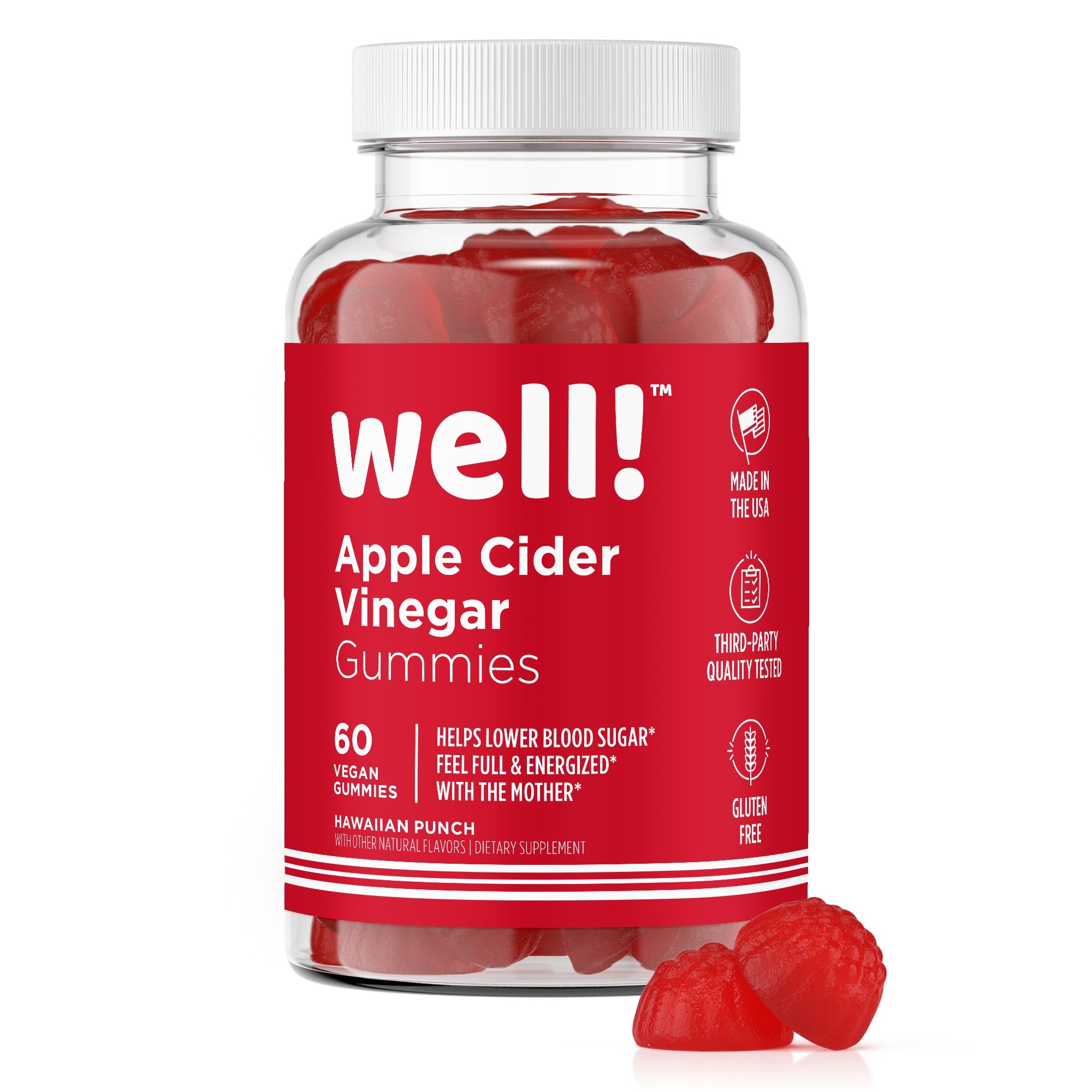
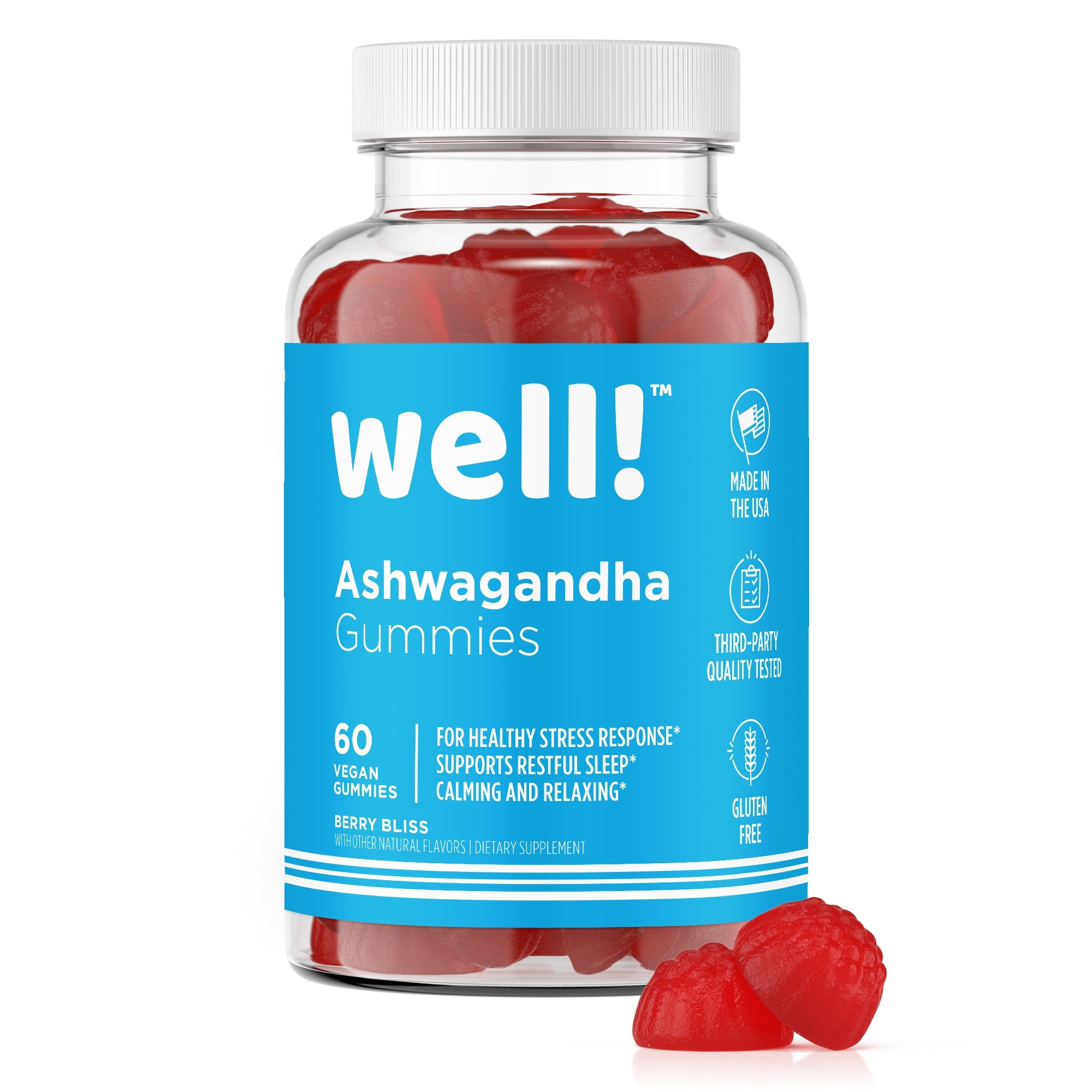
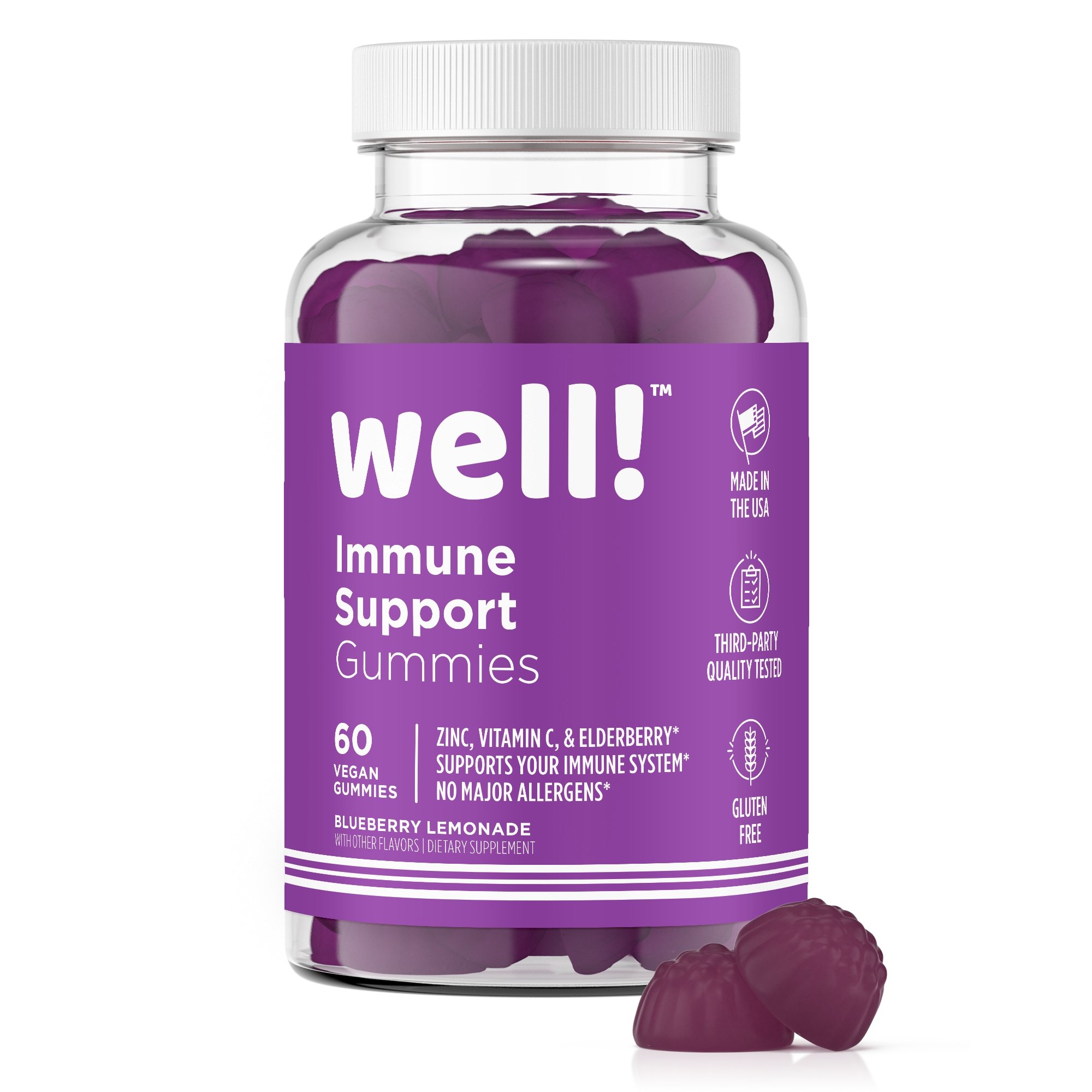
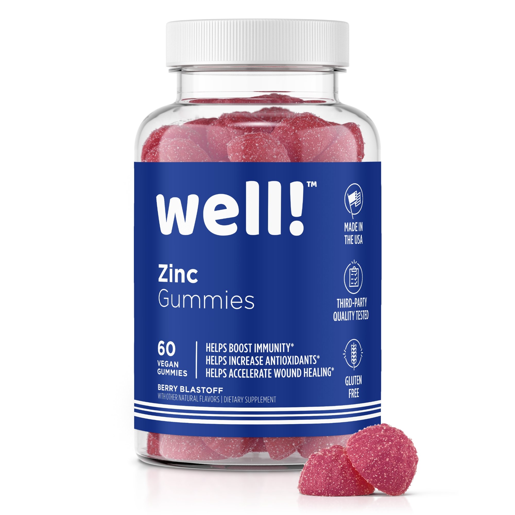
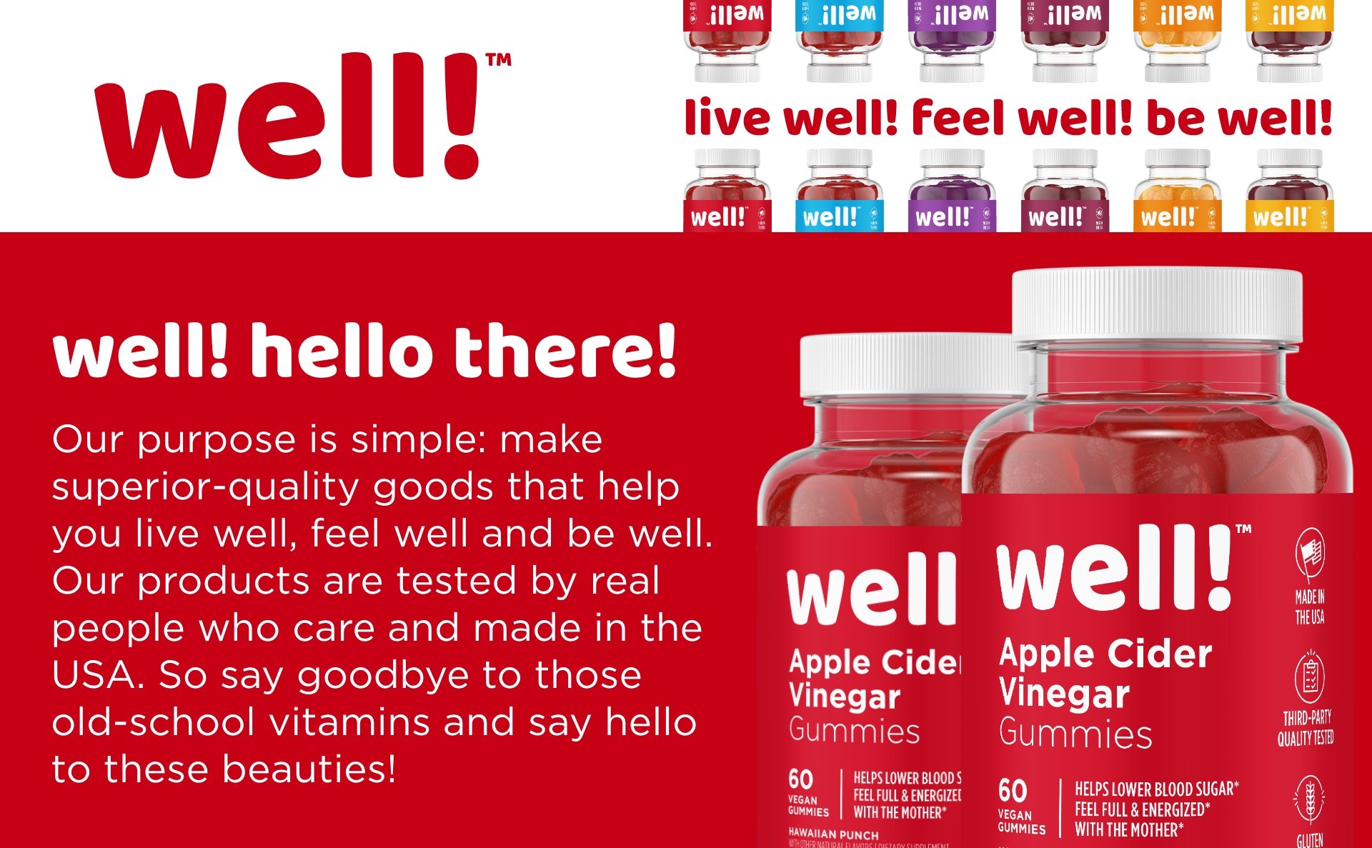
In a competitive landscape where supplements blend into a sea of drab pill bottles, Well! needed packaging that commanded attention. We began by focusing on four lead SKUs: Apple Cider Vinegar Gummies, Ashwagandha Gummies, Immune Support Gummies, and Zinc Gummies. These diverse products presented varying naming lengths and health benefits, requiring a strategic approach to crafting a design system. The resulting labels showcased a robust brand identity with a clear hierarchy and bold, eye-catching colors. The goal was for Well! products to stand out instantly amongst competitors in the Wild West of Amazon storefronts.
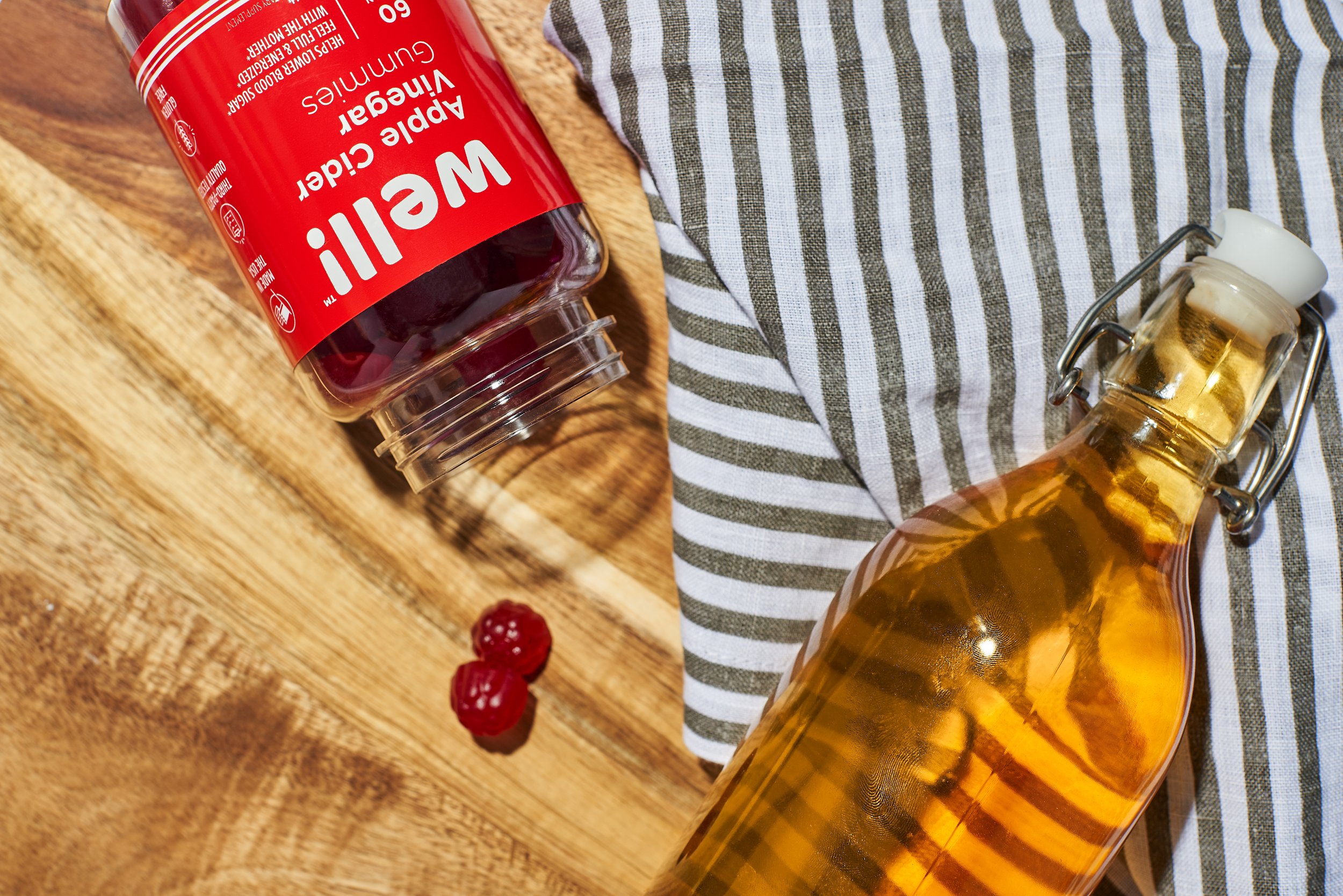
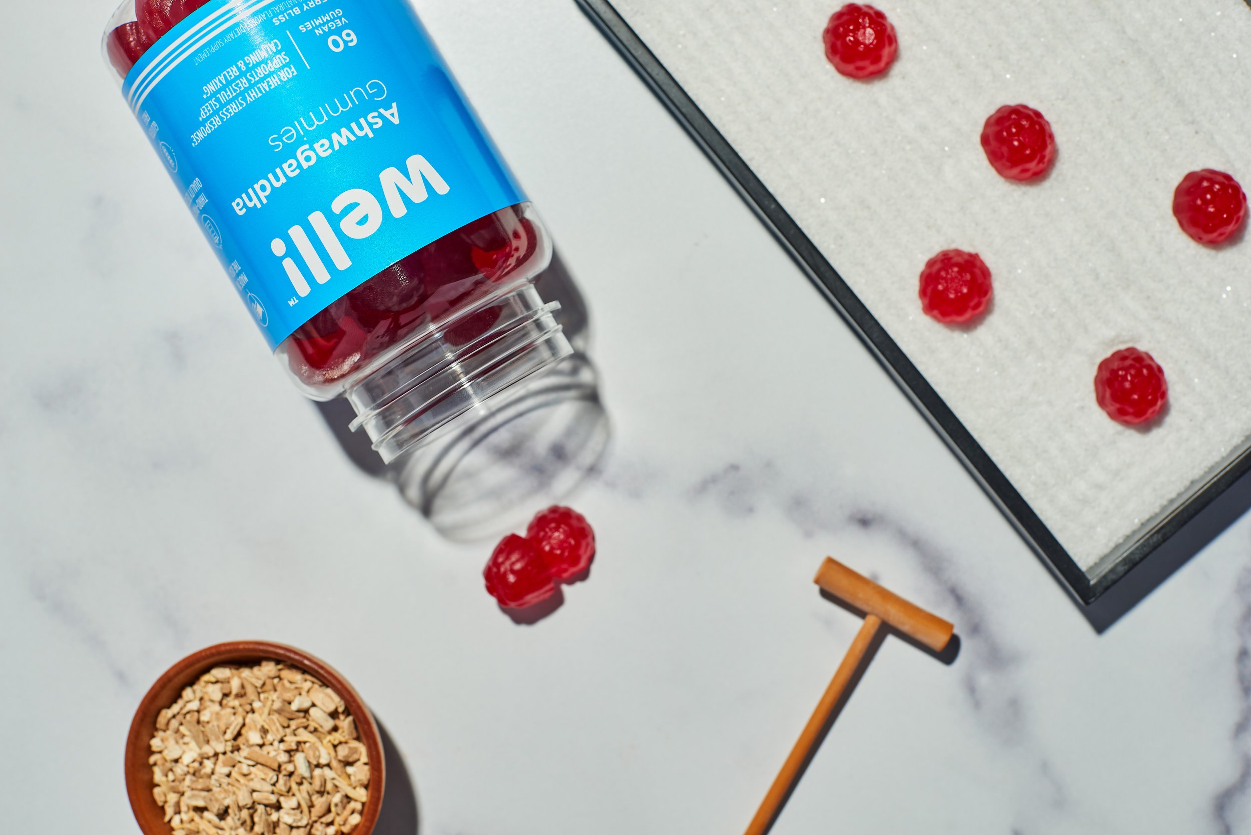
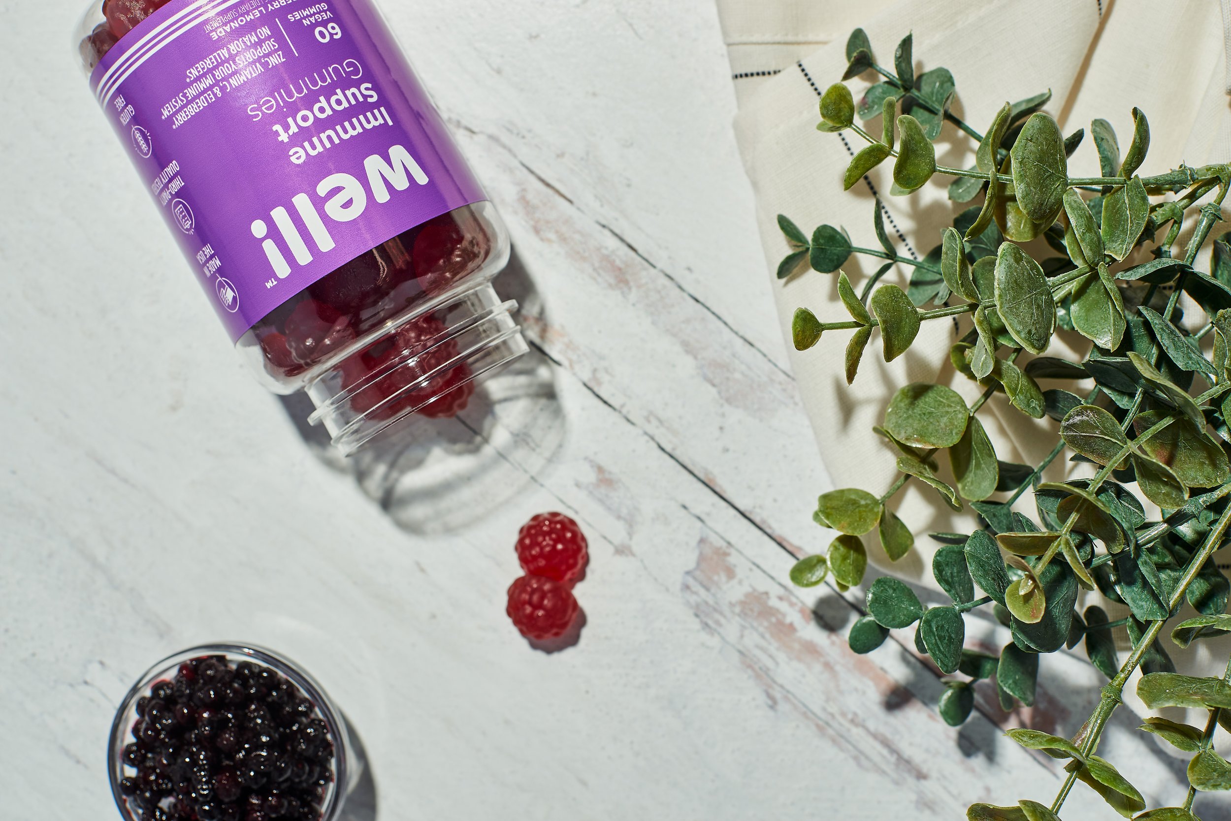
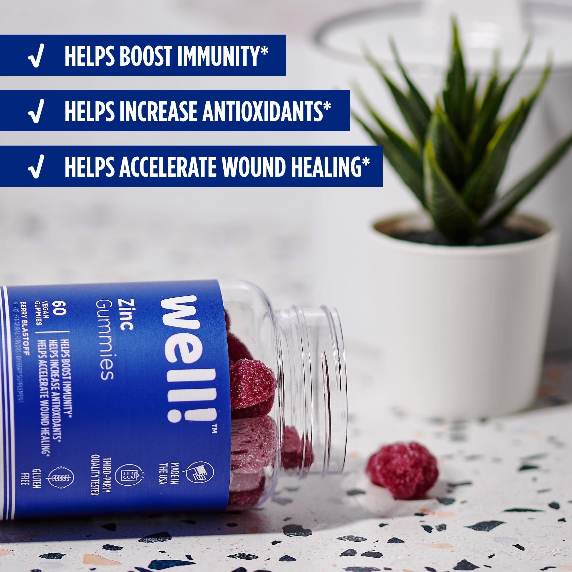
For the Apple Cider Vinegar Gummies, a refreshing and bold red was chosen to embody the age-old adage, "An apple a day keeps the doctor away." This color harmonized beautifully with the gummies themselves, and a stark white was used for visual elements, creating a striking and easily readable contrast that became a hallmark of the design system. The same design philosophy carried through to other SKUs, with cyan for Ashwagandha, navy for Zinc, and purple for Immune Support. Well! products were designed to be unmistakable in a market saturated with mundane pill bottles.
Creating the Well! Lifestyle
The impact of our packaging design guided our product photography. Our vision was to make Well! products feel like they belong on the countertop, where you’ll remember to take them, not stuffed in some medicine closet. We meticulously crafted every image, emphasizing sharp contrast, vibrant colors, and a saturated lifestyle look. The goal was to make potential customers feel as if they were about to pick up these gummies from their own kitchen counter on a sunny morning.
Informative, Engaging, and Playful
Amazon's marketplace demands informative and engaging content. Leveraging the stunning photography, we created enhanced brand content that was both informative and playful. Every pixel introduced Well!'s vibrancy and infused the brand's unique witty tone into the content. Playful icons complemented informative tidbits, ensuring customers felt confident about their choice. Well! doesn't just sell gummies; they sell a lifestyle of wellness, and this message was expertly conveyed through the Amazon listings.
Turning Customers into Lifelong Fans
In the competitive wilderness of Amazon, customer loyalty is a precious commodity. Recognizing this, we designed a simple yet heartfelt thank-you card to express Well!'s gratitude for every order. This thoughtful touch was a testament to Well!'s commitment to its customers, transforming one-time buyers into lifelong advocates.
A Bold New Brand
This endeavor introduced a vibrant and innovative brand to the supplement market and redefined wellness for a new generation. We extend our heartfelt thanks to Jake Ippolito, John Paul Scott, and Becca Thill for their invaluable collaboration, helping us transform Well! from a promising startup into a brand encouraging individuals to live well, feel well, and be well.
