New Age Naturals Website Redesign
Think of the last time you had a hassle-free online shopping experience. Now, take that up a notch. This was our primary goal when redesigning the e-commerce website for New Age Naturals. We wanted to create a website where buying vitamins and supplements was an enjoyable, thoughtless, and effortless journey. From easy browsing and purchasing to managing subscriptions with simplicity, we built a platform that stood out. Starting in early 2021, our collaboration with New Age was all about transforming the mundane task of health shopping into an engaging, streamlined experience, culminating in a website we launched launch in July 2021.
Website product landing page for New Age Naturals.
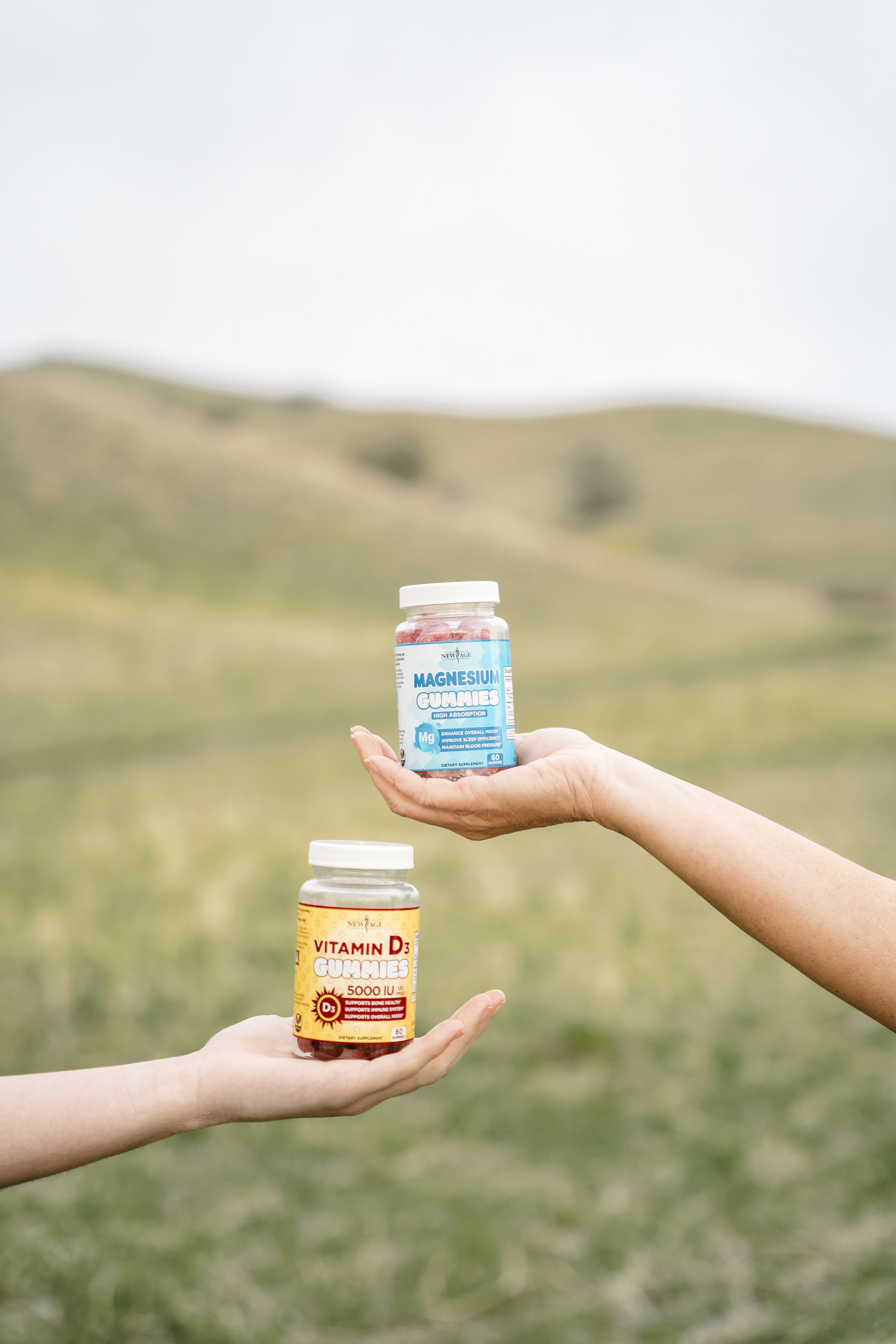
Initially, New Age approached us for some straightforward product photography. But their product lineup was a bit like putting together a bunch of different jigsaw puzzles, each from different boxes. Every time a customer touched the New Age brand, they felt like they were entering different universes—only unified by slapping the New Age logo on the front of the label or at the top of the webpage. We talk a bit about our initial product photography assignment and giving their packaging a facelift in a later project in these case studies below:
To fix this, we aimed to implement brand unity to the website while baking-in the idea that each supplement carried unique benefits for the customer. We knew that our primary target audience was women between the ages of 25 and 60. This led us to choose a softer global color palette for the site, paired with rounded edges on buttons and image frames, and photography that heavily featured women.
Redesigned mobile landing page for the New Age Naturals Website.
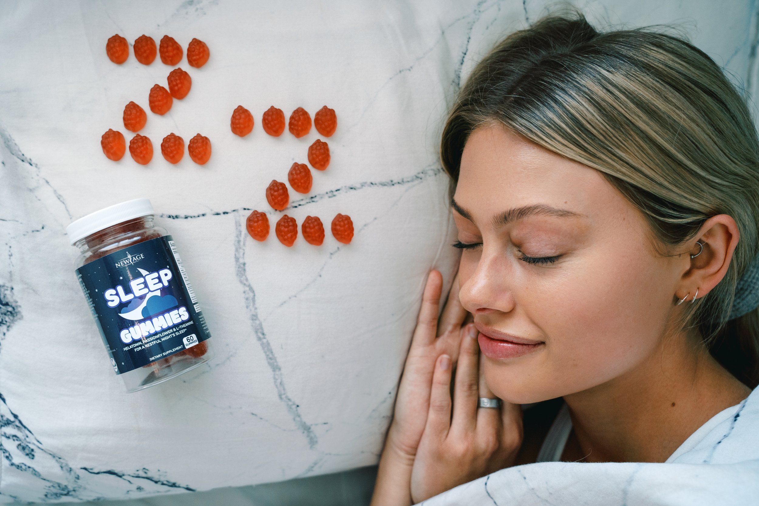
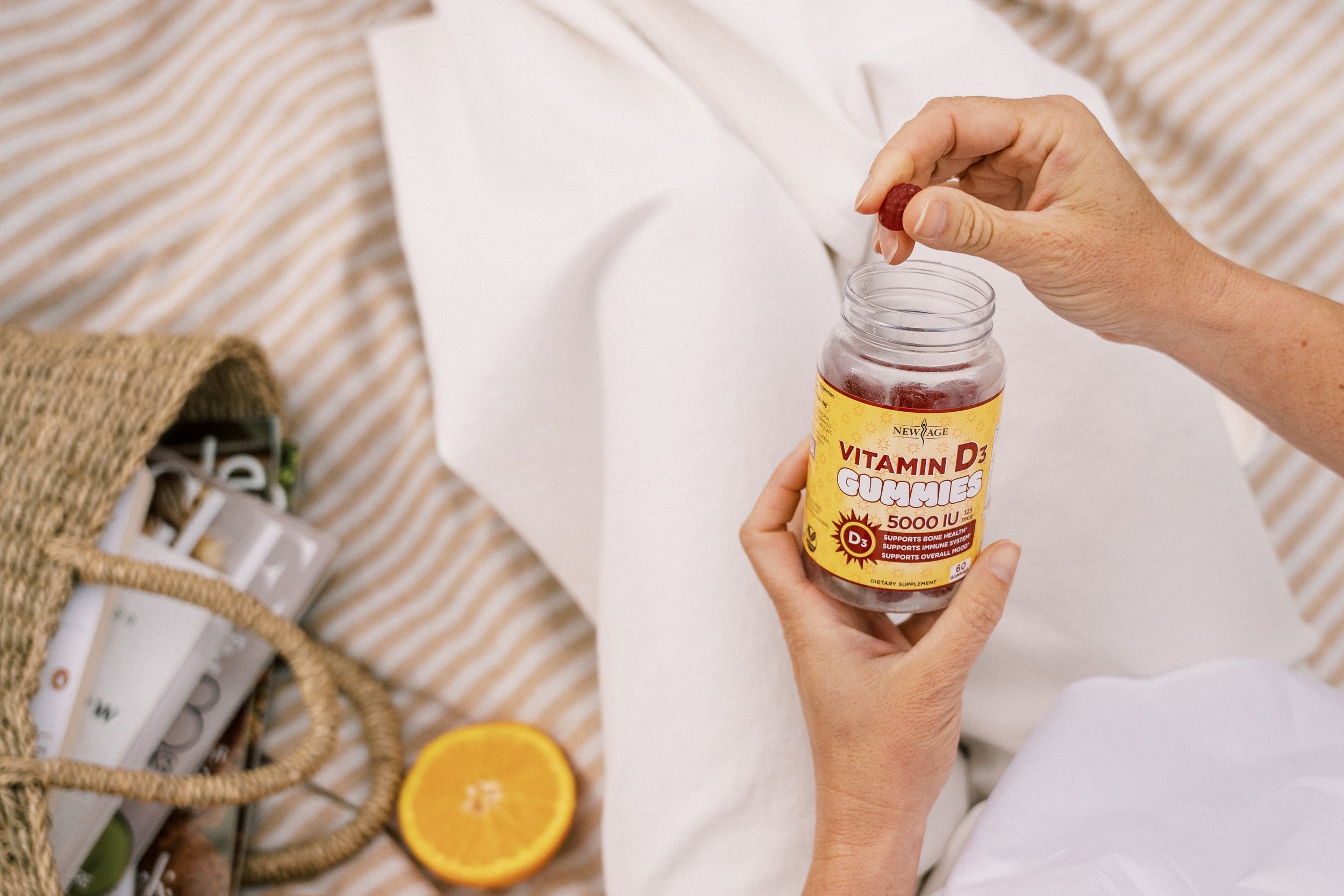
To help with the product photography, we brought in an incredible woman-focused lifestyle photographer, Emily Bridgeman. We collaborated together to produce a two-day long shoot with three models and 18 separate products. Ultimately, our final shot count boiled down to just shy of 1000 final images to add to the New Age image library.
Lifestyle Photography above by Emily Bridgman Photography.
One of our biggest goals during the site redesign was to reduce the overall amount of time it took to launch new products on the site. Previously, every product required a bespoke approach as the style of the product page originally adopted the look and feel of the product label. This older approach was extremely laborious and time-consuming. To solve for this, we introduced a more template-driven approach. Simplifying the product pages was like hitting the fast-forward button, cutting down the time it took to design and launch a product from six-to-eight weeks down to less than two.
Before and after product listing pages for New Age Naturals' Website.
Early-on in our research, we uncovered that most customers wanted the option to have their supplements delivered automatically without the need to place another order. By this point in society, customers were uniquely trained to be accepting of the subscription model for things like pet food, but not necessarily for vitamins and supplements. With this research, we chose to add a the option for customers to have their supplements delivered each month, but this came with another problem. Customers needed a super user-friendly way to manage their subscriptions—giving them the option to not just cancel their subscription, but to simply pause it. This feature significantly increased the New Age customer’s lifetime value.
User task flow to pause or cancel a product subscription on the New Age Website
If there's one big takeaway from this whole experience, it’s the power of creating continuity in your brand.
When we started the website redesign project for New Age, it was important for us to take a step back, look at the entire canvas, to paint an entirely new picture for what the New Age online shopping experience should look, feel, sound, and be like. We started the project in early 2021 and, by July of that same year, we had completely transformed the customer’s online experience that made everyone involved very proud.


